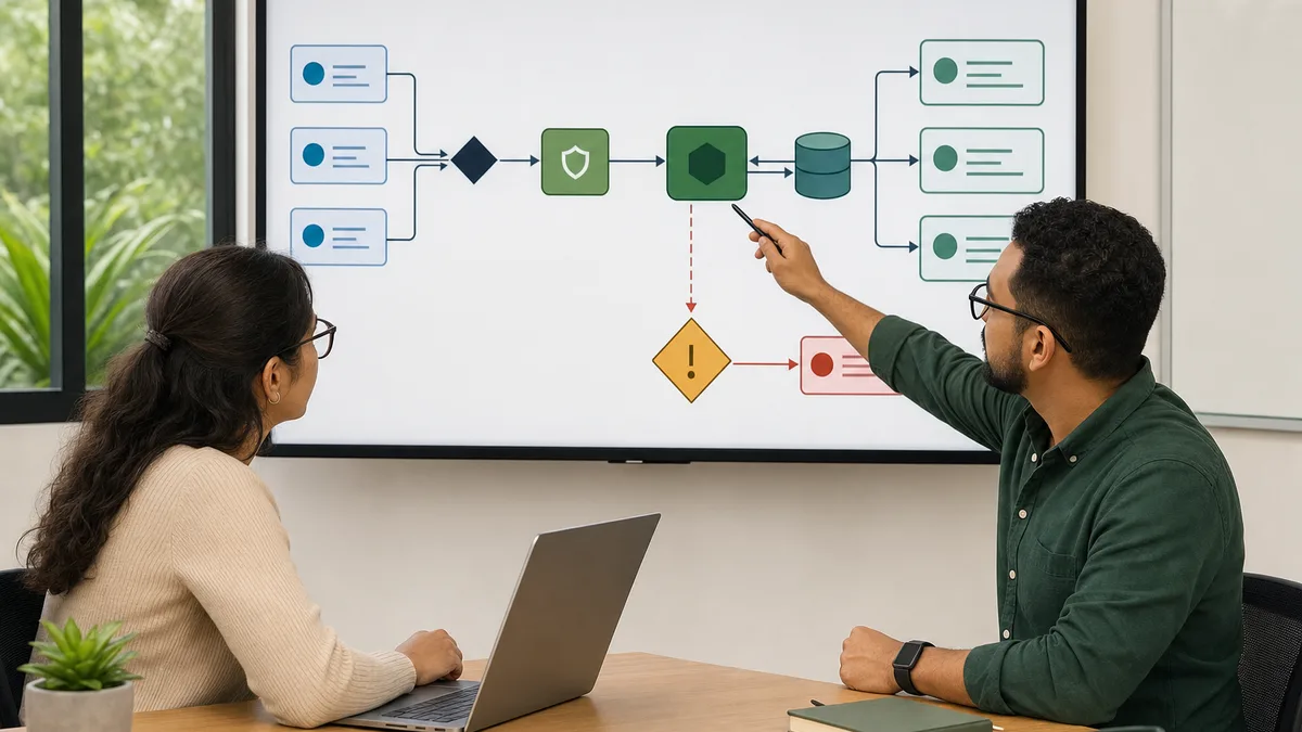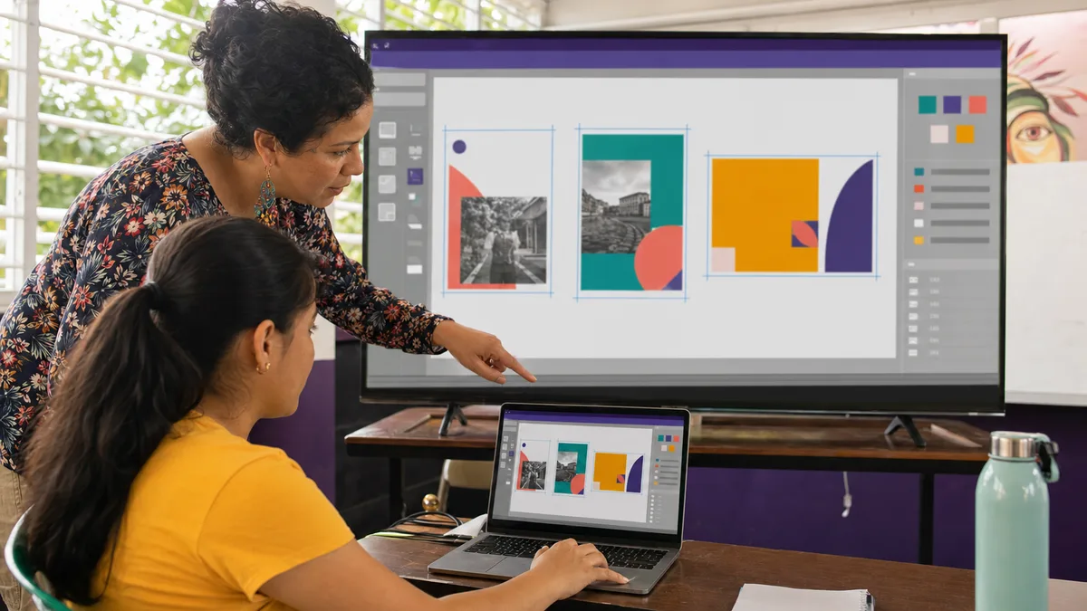
UX and UI are not synonyms, and they are not fancy names for “making pretty screens.” UX is concerned with how a person understands and completes a task; UI focuses on the visual and interactive interface used to perform that task.
This URL has a distinct signal worth preserving. During the reviewed 90-day window it received 34 impressions and one click. It appeared for searches such as “diseño ux en panama” and several explicit UX/UI course queries, some between positions 1 and 10. A separate Figma-focused URL, by contrast, received no impressions during the same window. Useful Figma material should therefore be concentrated here inside a broader UX/UI guide.
What should a beginner learn first?
Before mastering a tool, understand the process that turns a problem into an interface that can be tested.
A reasonable beginner path covers:
- problem and objective;
- user and context;
- content and flow;
- wireframes;
- visual design;
- prototype;
- user testing;
- iteration;
- documentation and handoff.
You do not need academic research for a first exercise. You do need to avoid designing only from your own preferences.
UX starts with a concrete task
A question such as “how do I improve this app?” is too broad. Define an observable task instead:
- book an appointment;
- submit a request;
- find a price;
- complete a purchase;
- recover a password;
- understand the status of a process.
Then ask:
- Who performs the task?
- What information is needed before starting?
- What can go wrong?
- How does the person know it was completed successfully?
- Which steps are truly necessary?
This prevents you from creating attractive screens that fail to solve the main problem.
Basic research without inventing “personas”
A fictional person with a name, age, and stock photo does not automatically become UX research.
For a small project, start with more direct evidence:
- conversations with real users;
- support tickets or recurring questions;
- internal searches;
- notes from sessions;
- observed form errors;
- questions people ask before buying;
- flow analytics when available and used responsibly.
Document what you learned and what remains a hypothesis. Do not present an assumption as if users had validated it.
Flows before screens
Before opening Figma, draw the main journey.
For an appointment request, for example:
Start → choose service → choose time → minimum data → confirm → result
Then add exceptions:
- slot already taken;
- invalid input;
- interrupted connection;
- user goes back to change a choice;
- service requires additional information.
A flow exposes problems that a single isolated screen may hide.
Wireframes: decide structure before decoration
Wireframes make it possible to discuss hierarchy and navigation before investing time in colors, typography, and images.
Check:
- what appears first;
- which action is primary;
- which information can wait;
- whether controls have clear labels;
- what happens when there is no data;
- how errors are shown;
- how the person returns to a previous step.
A wireframe can be drawn on paper. The tool is not important yet.
Where Figma fits
Figma is useful for turning structures into visual components, clickable prototypes, and reusable systems. It can support:
- frames and layouts;
- components and variants;
- Auto Layout;
- styles and variables;
- prototypes;
- comments and review;
- design-to-development handoff.
Learning Figma makes more sense when each feature solves a project need. Auto Layout, for example, is easier to understand by building a card that must grow with variable content than by memorizing every control in isolation.
UI: hierarchy, readability, and consistency
A first interface should make it easy to tell:
- where I am;
- what I can do;
- what is most important;
- which information belongs together;
- what changed after an action.
Work with:
- contrast;
- type size and weight;
- spacing;
- alignment;
- control states;
- component consistency;
- error and confirmation messages.
Do not rely on color alone to communicate an important state. A person who has difficulty distinguishing certain colors should still be able to understand the result.
Accessibility from the beginning
Accessibility should not be added at the end as a correction list.
During design, ask:
- Is the contrast sufficient for reading?
- Do controls have understandable names?
- Does the information order make sense without relying only on visual position?
- Are touch targets reasonable?
- Does an error message explain what needs to be corrected?
- Can the flow be completed by keyboard where appropriate?
- Is animation necessary to understand the interface?
You do not need to be an accessibility specialist to start avoiding basic problems.
Prototypes: use the fidelity that answers the question
Not every prototype needs to look like a finished application.
Low fidelity
Useful for testing structure, navigation, and comprehension.
Medium fidelity
Useful for validating hierarchy, content, and main components.
High fidelity
Useful when testing visual details, transitions, or an experience close to the final product.
If your question is “can the person find where to book?”, a simple prototype may be enough. Photorealism does not automatically improve the test.
How to run a small usability test
A first exercise can use a small number of participants as long as you are explicit about its limits.
- Define one task.
- Give context without telling the person exactly where to click.
- Observe before explaining.
- Record where the person hesitates, goes back, or interprets something differently.
- Ask what they expected to find.
- Fix the prototype.
- Retest important changes.
Do not turn “two people liked it” into evidence that the product will work for an entire market.
What should a UX/UI portfolio show?
A useful portfolio is more than a gallery of final screens. It should make it possible to understand:
- the problem;
- constraints;
- what you investigated;
- which hypotheses you made;
- how the flow changed;
- what you tested;
- what you learned;
- what remained unresolved.
If the project is fictional, say so. If you redesign an existing brand without being connected to it, label the work as an exercise.
How to evaluate a UX/UI course
Before enrolling, ask:
- Does the course work on a real problem or only copy screens?
- Does it include research and testing, not only Figma?
- Does each participant receive feedback on their work?
- Does it cover errors, empty states, and alternative scenarios?
- Is accessibility discussed?
- Does the portfolio project document process and decisions?
- What previous experience is required?
- Which tools and accounts do you need?
- Does any certificate offered accurately represent the program?
A UX course that teaches only where Figma buttons are located is too narrow. A course that talks about research without letting you observe or test anything is also incomplete.
One complete beginner exercise
Take a contact or booking page and work through this cycle:
- identify the main task;
- collect five real user questions or problems;
- draw the flow;
- create wireframes;
- design a visual version;
- build a prototype in Figma or another tool;
- ask several people to complete the task;
- document three observed problems;
- iterate;
- write a short case study showing the starting point, decision, and result.
That exercise teaches more UX/UI than reproducing a popular screen pixel by pixel.
Training and Crezendo
Crezendo maintains training areas related to design and digital skills, but availability, level, and delivery format must be confirmed. Review the current workshops or ask about a specific need.
This guide should not be interpreted as an announcement of a permanently open UX/UI or Figma cohort. If you are looking for training, describe your current level, objective, and the type of project you want to be able to solve.