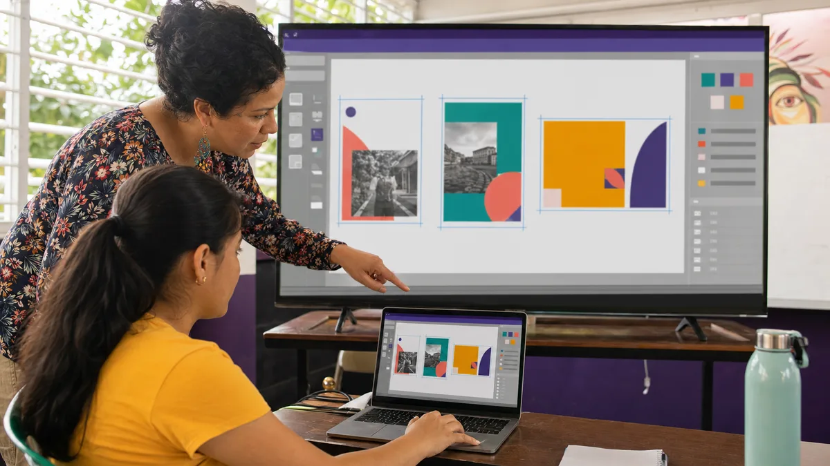
Canva can be useful for creating visual material without starting from a complex professional-design canvas, but using Canva does not replace design principles or guarantee that a piece communicates well.
This URL received 20 impressions during the reviewed window, including “canva panama” searches around position 9. That supports keeping a dedicated page, but with a clearer purpose: teaching a workflow for producing consistent, readable material for business, study, or professional communication.
Start with the objective, not the template
Before opening Canva, define:
- what you are creating;
- who will see it;
- which action or understanding you expect;
- which information is mandatory;
- where it will be published;
- which format and dimensions it needs.
An Instagram post, a presentation, a printed menu, and an informational PDF may share the same visual identity, but they do not have the same structure.
A template is not a finished design
A template can save time, but it should be adapted to real content.
Review:
- title hierarchy;
- amount of text;
- contrast;
- photographs;
- colors;
- logo;
- margins;
- call to action;
- final output format.
If you leave a template almost untouched merely because it “looks professional,” you may end up with a generic piece that does not represent your message or brand.
Build a simple visual hierarchy first
A piece should make it easy to distinguish:
- primary message;
- secondary information;
- final action or detail.
Do not give every text element the same size and weight. Use differences in size, spacing, alignment, and contrast to indicate what should be read first.
A useful test is to step back from the screen: can you still tell what the main message is?
Typography: fewer fonts, more consistency
For a small business, a stable typographic system is usually more useful than using a different font for every post.
Define:
- heading font;
- body font;
- reasonable minimum sizes;
- style for numbers, prices, and calls to action;
- consistent capitalization.
Avoid making text too small merely to “fit everything.” If a piece needs too much information, it may require another layout or more than one page.
Color: use contrast and meaning
Colors should support readability and brand recognition rather than compete for attention.
Check:
- contrast between text and background;
- that an important action does not depend on color alone;
- consistency across pieces;
- readability when text sits on a photograph;
- how the design looks on a small screen.
A brand color can be important, but it does not justify unreadable text.
Photographs and visual resources
When you have your own product, team, or location photographs, they can provide more authenticity than generic stock imagery.
Before uploading an image:
- check resolution;
- avoid excessive compression;
- crop for the final format;
- do not stretch it out of proportion;
- confirm that you have the right to use it;
- avoid exposing private information in screenshots or photos.
When using content from Canva's library, remember that usage is governed by the corresponding license agreement. Downloading an image does not make that library asset exclusively owned by your business.
Licensing: review content before publishing
Canva maintains a Content License Agreement covering the use of assets available within the platform.
Before using a design commercially:
- identify which resources are yours;
- identify which came from Canva or another library;
- review any applicable restrictions;
- keep a copy of the design and critical source material;
- do not claim exclusive ownership over third-party content.
Feature and asset availability can change by plan. Check your account and current documentation before making a business workflow depend on one specific function.
How to adapt a template to a brand
A practical routine:
- replace sample text with real content;
- remove decorative elements that add no value;
- apply the brand palette;
- use a stable typographic system;
- replace generic photos when you have stronger owned material;
- check logo placement and margins;
- review the piece at its actual publishing size;
- export and reopen the final file.
The last step matters: a design that looks good inside the editor can have problems after export or when viewed on another device.
Social media: design a family of pieces
Instead of creating every post from scratch, define a small system for:
- headline or cover;
- educational post;
- promotion;
- testimonial or case;
- event announcement;
- call to action.
Reusable visual components help maintain consistency without making every post identical.
For a small business, this reduces production time and prevents every piece from looking like it belongs to a different brand.
Presentations in Canva
Canva can also be used for presentations. Apply the same rule as in any presentation tool: each slide should have an identifiable message.
Avoid:
- full paragraphs on every slide;
- unreadable tables;
- distracting animation;
- unrelated stock imagery;
- text on low-contrast backgrounds.
For a broader guide to structure, evidence, and rehearsal, see effective presentations at work.
Print material: do not design only for the screen
When the destination is print:
- confirm final dimensions;
- leave appropriate margins;
- check bleed when the printer requires it;
- export in the format requested by the provider;
- verify legibility with a physical proof when the piece matters.
Different print providers may use different specifications. Ask before producing hundreds of units.
Accessibility and readability
A visual piece can be attractive and still be difficult to read.
Check:
- contrast;
- text size;
- reading order;
- icon clarity;
- captions in video when appropriate;
- alternative text on the publishing platform;
- that essential information is not communicated only through color.
Canva makes composition easier, but the design decision remains yours.
Export: choose the format for the destination
There is no single “best” format for every case.
- PNG/JPG: images for web and social channels, depending on the need.
- PDF: documents or print workflows, according to specifications.
- Video: animated material when the channel requires it.
Exact export options may vary with product and plan. Verify the downloaded result and do not keep the only important copy of a business asset inside an external platform.
One useful exercise for learning Canva
Create a three-piece mini campaign for a real or fictional business:
- a post that explains a problem;
- a piece that presents a product or solution;
- a call to action.
Use the same palette, typography, and visual language. Then review:
- Do all three look like the same brand?
- Is the message understandable without excessive reading?
- Is the CTA clear?
- Does the piece work on mobile?
- Does every asset have an allowed use?
That exercise teaches more than copying twenty templates without criteria.
What should someone learn beyond Canva?
Consistent visual communication also benefits from skills in:
- composition;
- typography;
- color;
- basic photography;
- visual identity;
- writing;
- accessibility;
- export requirements.
For a broader foundation, see how to learn graphic design without experience.
Training and Crezendo
Crezendo maintains areas related to digital tools, design, and communication, but this page does not announce a permanent Canva course. Review the current workshops or ask about a specific need.
The tool is only part of the process. The real objective is to make repeatable visual decisions, explain why you made them, and produce material that works for its audience and channel.